换肤方案
方案一:纯 css 写主题样式
在 html 上定义例如 .light .dark 的主题类名,在使用时分开写:
.light {
  .btn {
    background: #fff;
    color: #000;
  }
}

.dark {
  .btn {
    background: #000;
    color: #fff;
  }
}
方案二:使用 scss 变量和函数生成多套主题
scss 方案适合内置主题的场景,因为需要编译阶段生成变量,所以不方便动态扩展主题的场景。
-
在
src/styles/theme.scss中定义主题颜色和 mixin@use "sass:map"; // $themes 中的 key 不要直接写颜色值,例如 red , 编译时会警告 $themes: ( redily: ( primary: #ff0000, background: #edb0b0, text: #330000, ), greenily: ( primary:rgb(5, 144, 5), background: #b7edb7, text: #003300, ), blueily: ( primary: #0000ff, background: #babaef, text: #000033, ), ); $currentTheme: 'red'; // scss 全局变量。编译过程中,在遍历 $themes 时缓存当前 useTheme 在处理的哪个主题 @mixin useTheme() { @each $key, $value in $themes { $currentTheme: $key !global; // 更新全局变量 html[data-theme="#{$key}"] & { @content; } } } // 查询主题中属性值函数 @function getVar($param) { @if map.has-key(map.get($themes, $currentTheme), $param) { @return map.get($themes, $currentTheme, $param); } @else { @warn "The variable #{$param} does not exist in the #{$currentTheme} theme."; @return null; } } -
将
theme.scss在vite.config.ts中配置成全局加载项,这样不需要在每个 scss 文件中导入就可以使用了// vite.config.ts export default defineConfig({ css: { preprocessorOptions: { scss: { additionalData: `@use "@/styles/theme.scss" as *;` } } }, }) -
使用
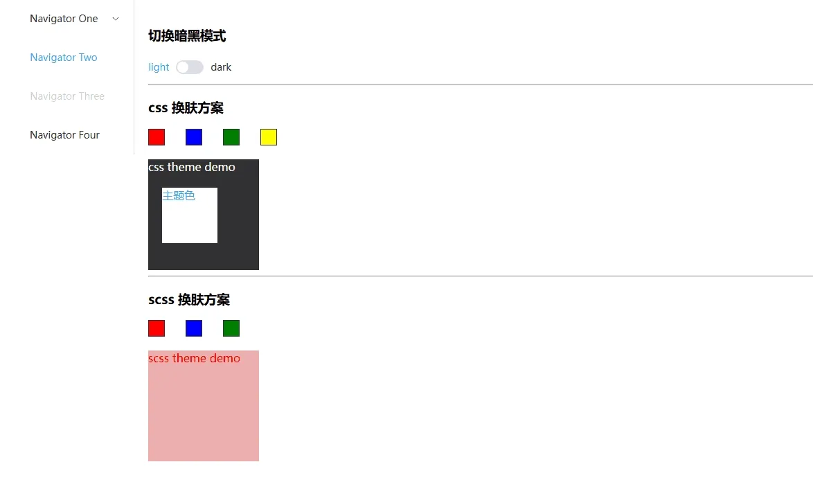
<template>
  <div>scss 切换主题方案</div>
    <div style="display: flex;">
      <div class="color-block" style="background: red;" @click="handleChangeScss('redily')"></div>
      <div class="color-block" style="background: blue;" @click="handleChangeScss('blueily')"></div>
      <div class="color-block" style="background: green;" @click="handleChangeScss('greenily')"></div>
    </div>
    <div class="scss-dom">
      <div class="block-box">
        <span>scss theme demo</span>
      </div>
    </div>
  </div>
</template>

<script setup lang="ts">
function handleChangeScss(theme: string) {
  document.documentElement.setAttribute('data-theme', theme)
}
</script>

<style scoped lang="scss">
.color-block {
  width: 22px;
  height: 22px;
  border: 1px solid var(--el-text-color-primary);
  margin-left: 30px;
}

.scss-dom {
  width: 100px;
  height: 100px;
  @include useTheme{
    background: getVar('background');
    color: getVar('primary');
  }
}
方案三:css 变量
可以直接复用第三方 ui 组件库定义的 css 变量,例如 element-plus 。这种方案应该是目前使用最广泛,扩展性最好的方案,除了 IE ,兼容性基本没有问题。
<template>
  <div style="display: flex;">
    <!-- 切换暗夜模式 -->
    <el-switch v-model="mode" inactive-text="light" active-text="dark" @change="toggleDark"/>
    <!-- 切换主题颜色 -->
    <div class="color-block" style="background: red;" @click="handleChangetheme('red')"></div>
    <div class="color-block" style="background: blue;" @click="handleChangetheme('blue')"></div>
    <div class="color-block" style="background: green;" @click="handleChangetheme('green')"></div>
    <div class="color-block" style="background: yellow;" @click="handleChangetheme('yellow')"></div>
  </div>

  <div class="custom-dom">
    <span>css theme  demo</span>
  </div>
</template>

<script setup lang="ts">
import { ref } from 'vue';
import { useDark, useToggle } from '@vueuse/core'

const mode = ref('light')

const isDark = useDark()
const toggleDark = useToggle(isDark) // 切换暗夜模式

// 改变主题颜色
function handleChangetheme(color: string) {
  document.documentElement.style.setProperty('--el-color-primary', color)
}
</script>

<style scoped lang="scss">
.custom-dom {
  width: 100px;
  height: 100px;
  background: var(--el-text-color-primary);
  color: var(--el-bg-color);
}
</style>